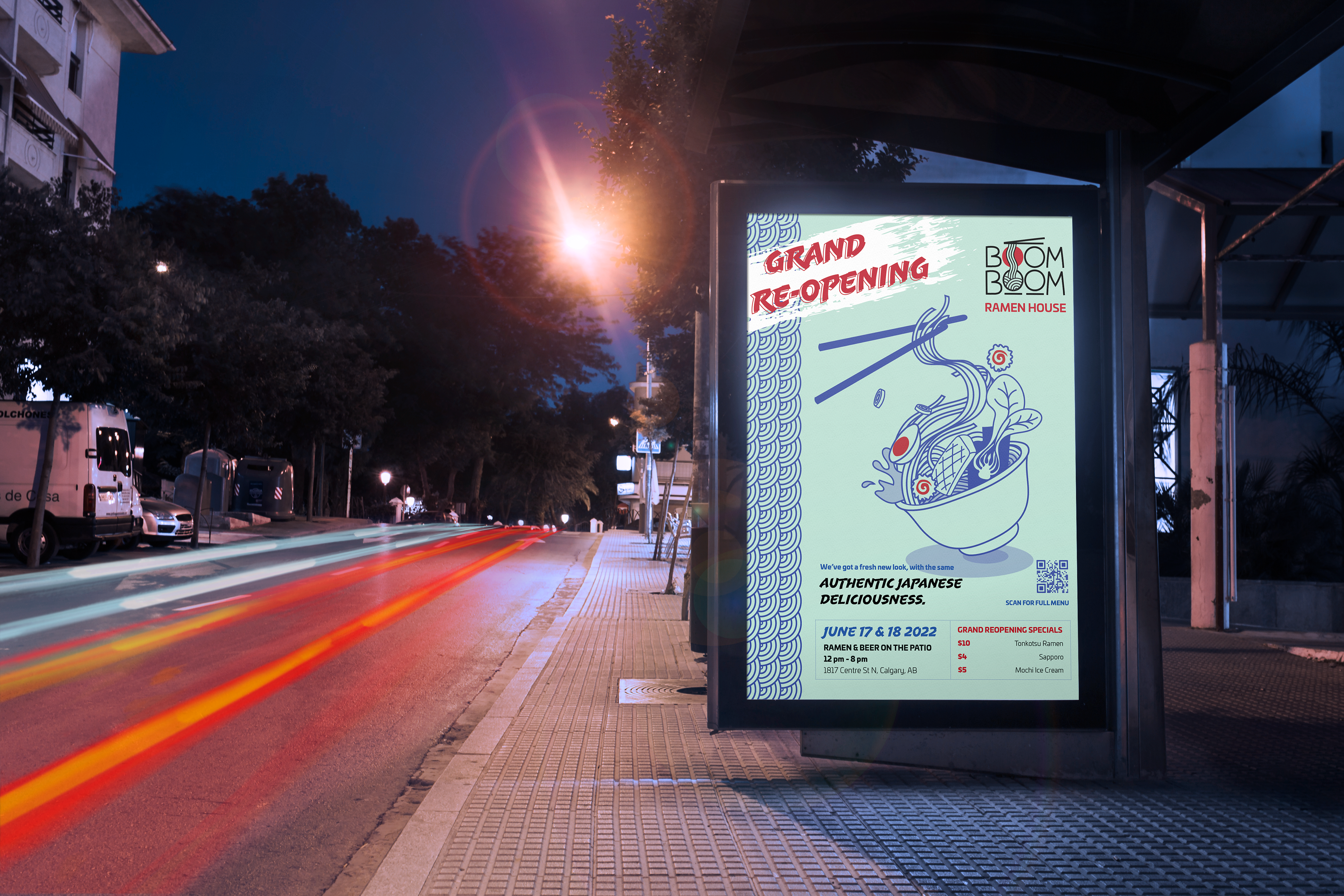
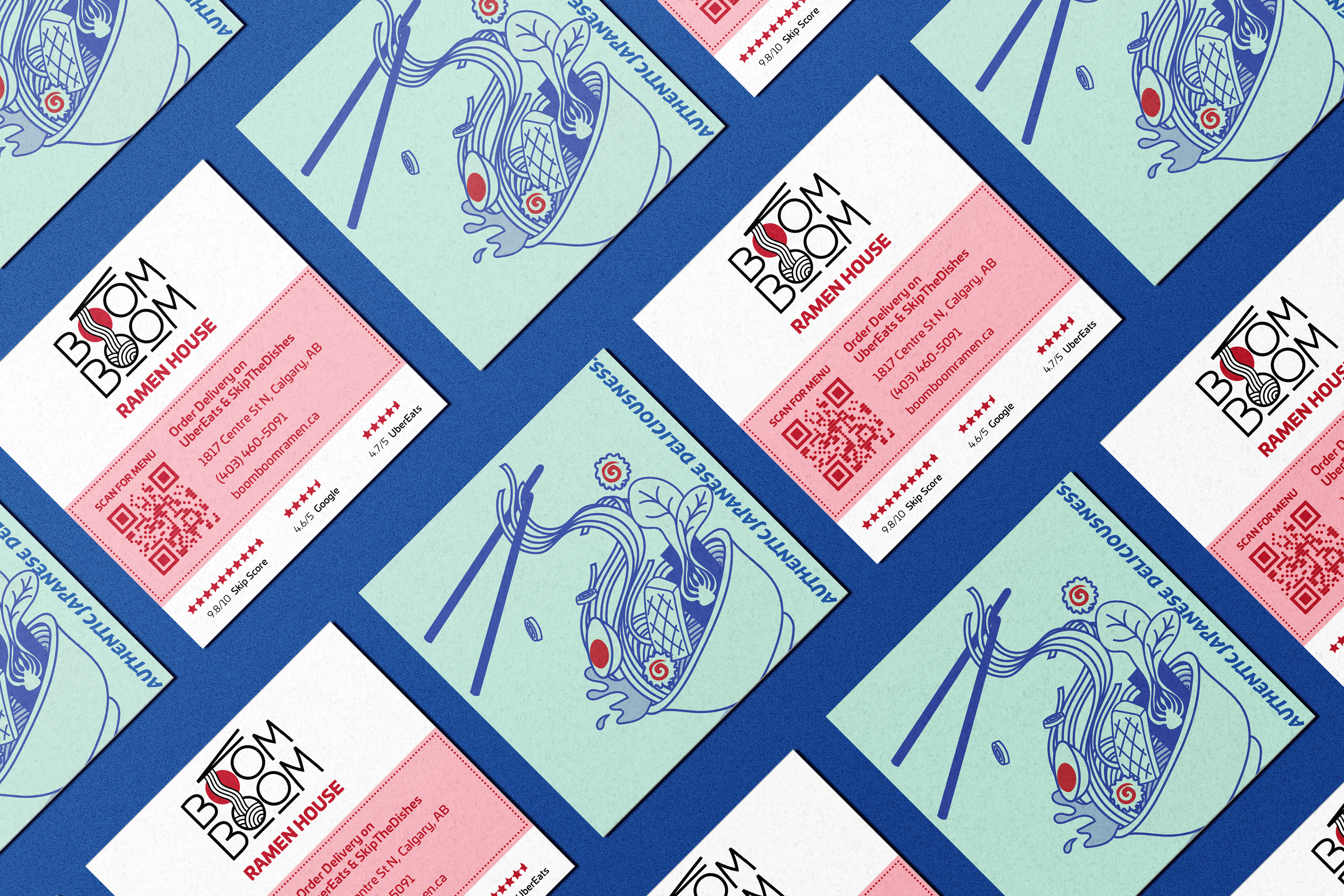
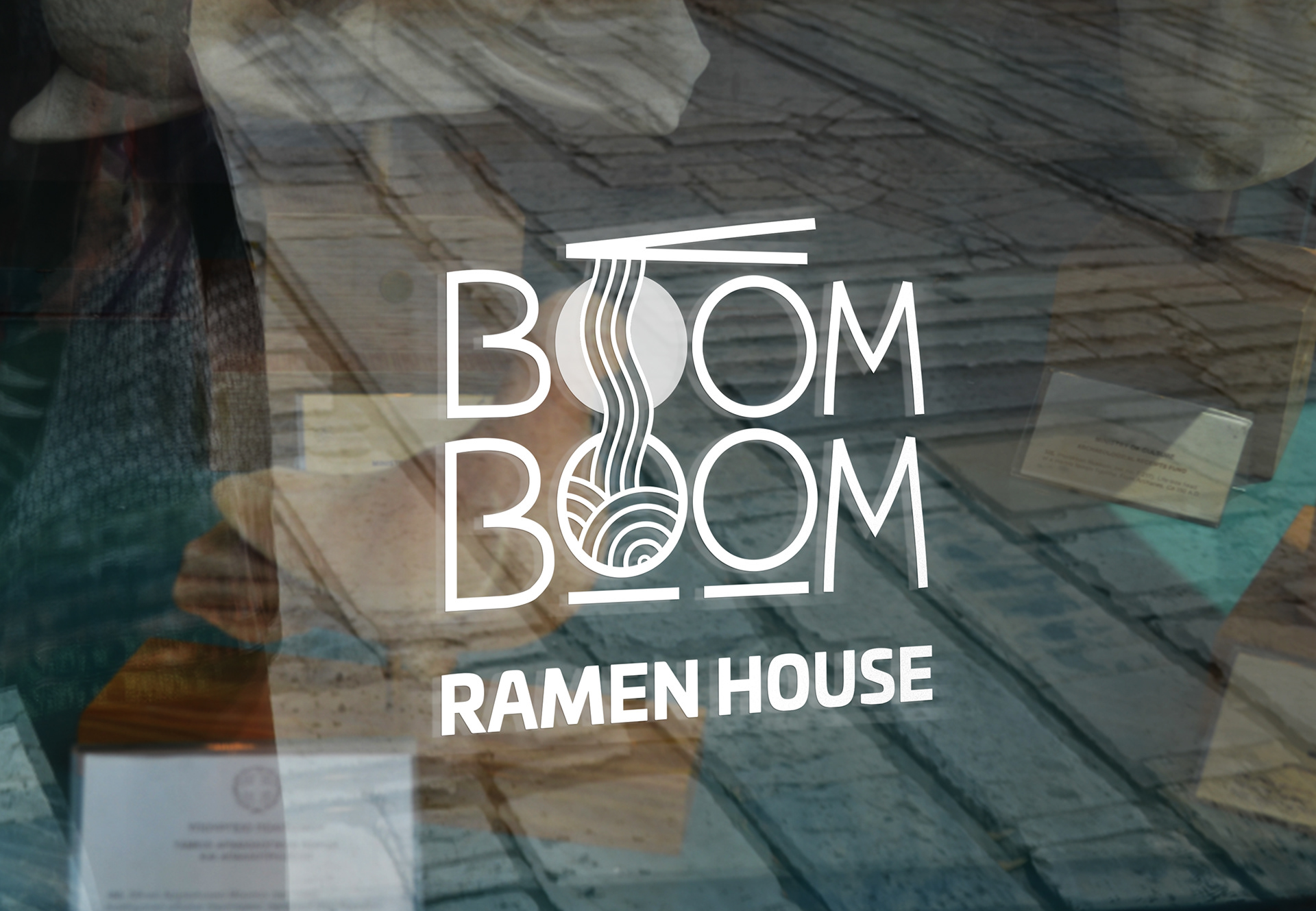
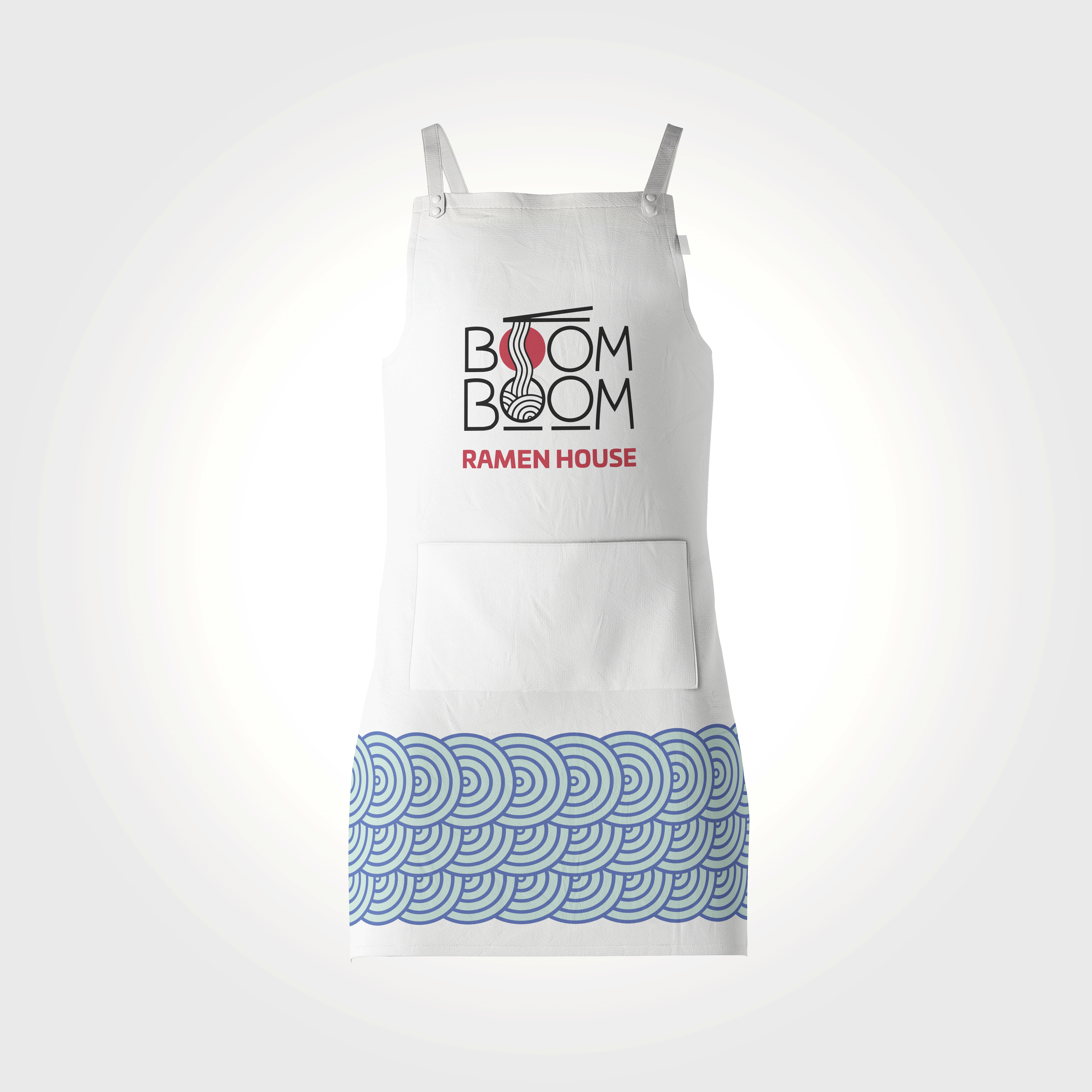
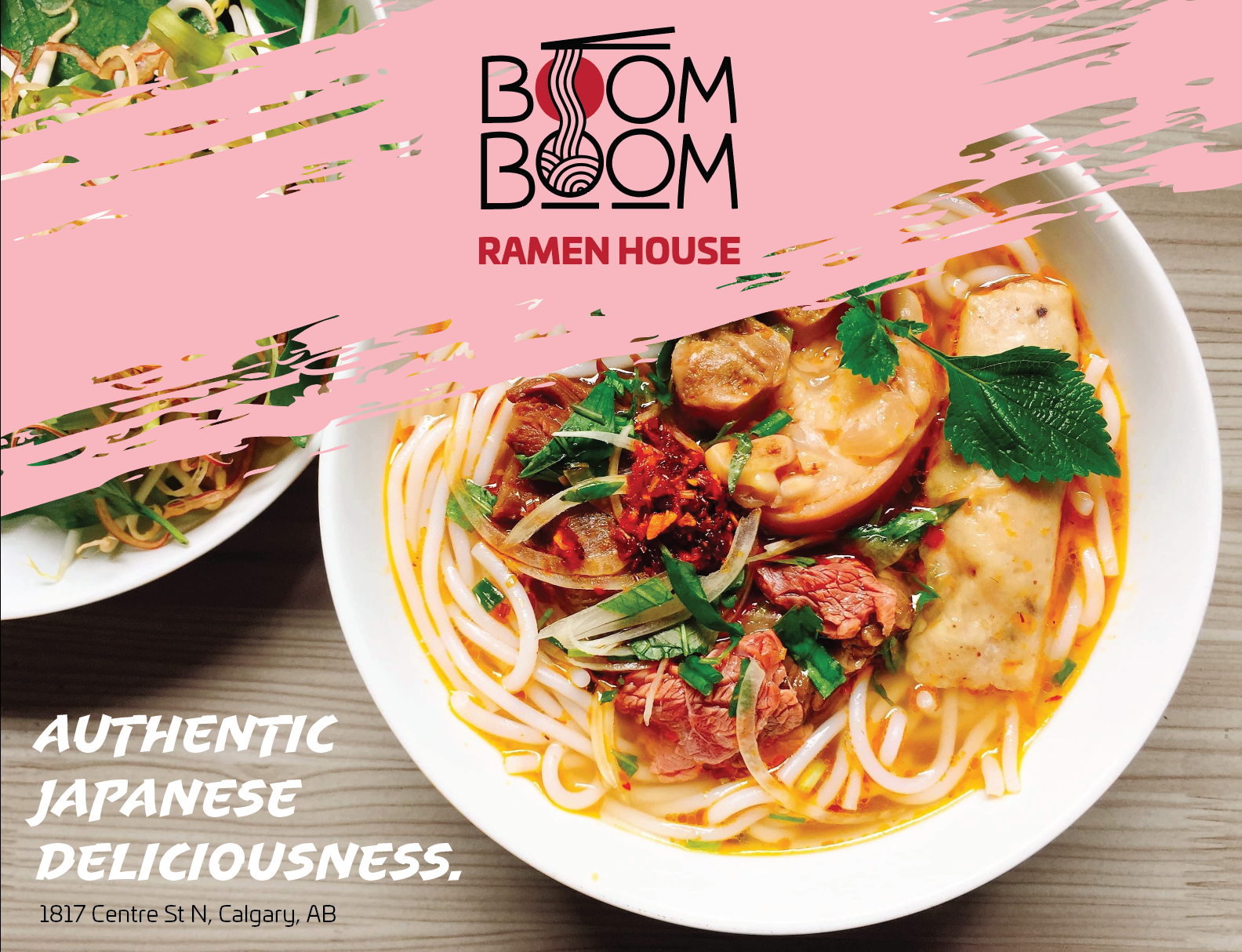
This re-brand uses an illustrative style to playfully communicate what this restaurant is all about: ramen. The stylized typography mimics the red rising sun of Japan's flag while using creative line work to evoke the aesthetics of Japanese letterforms, honouring the restaurant's Japanese ownership. The logo's illustrative style and colours communicate a fresh and fun personality that speaks to trendy young consumers, widening Boom Boom's customer appeal.


Brand Guidelines - Sample